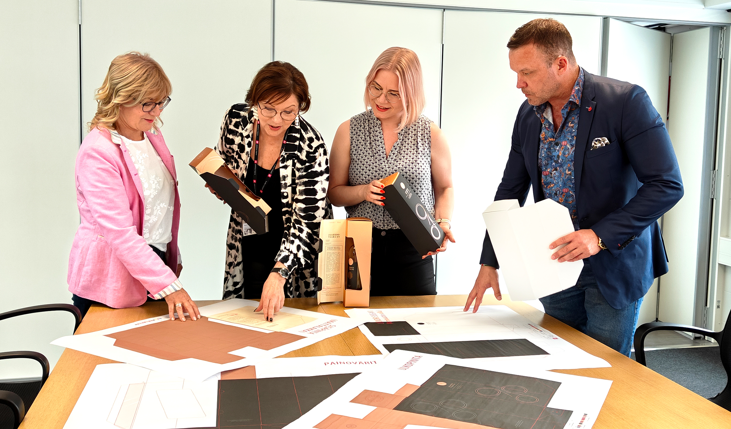
Jaakkoo-Taara celebrates its 90th anniversary this year and marks the milestone with a special anniversary bottle and packaging. Tommi Leppänen and Merja Mäkilä from Jaakkoo-Taara describe the project behind the packaging as inspiring.
– It was fun to design the case and label with all the ‘spices.’ It’s rare to come across projects where you can let your imagination run free. Our structural designer sketched a great 6-panel solution for the wine bottle case, says Leppänen.
Mäkilä shares the same view.
– We are very pleased with the dedication and professionalism of all our partners, and of course with the excellent final result, she rejoices.
The visual design of the package was created by Packdesign ID, with whom Jaakkoo-Taara has collaborated on numerous projects in the past. PREMerko Keuruu carried out the uniquely designed special printing for the package.
– We designed the external look of the case, provided input on the structure, and collaborated on the effects to be used in the execution with PREMerko’s Teemu Pärnänen, explains Maija Olkkonen-Seppo of Packdesign ID.
Jaakkoo-Taara’s wishes for the case were festivity and elegance, but otherwise, Packdesign ID had free rein for the visual concept and design.
– We sketched several ideas until the one chosen was perhaps the most restrained design, strongly based on refined minimalism and elegant effects, Olkkonen-Seppo continues.
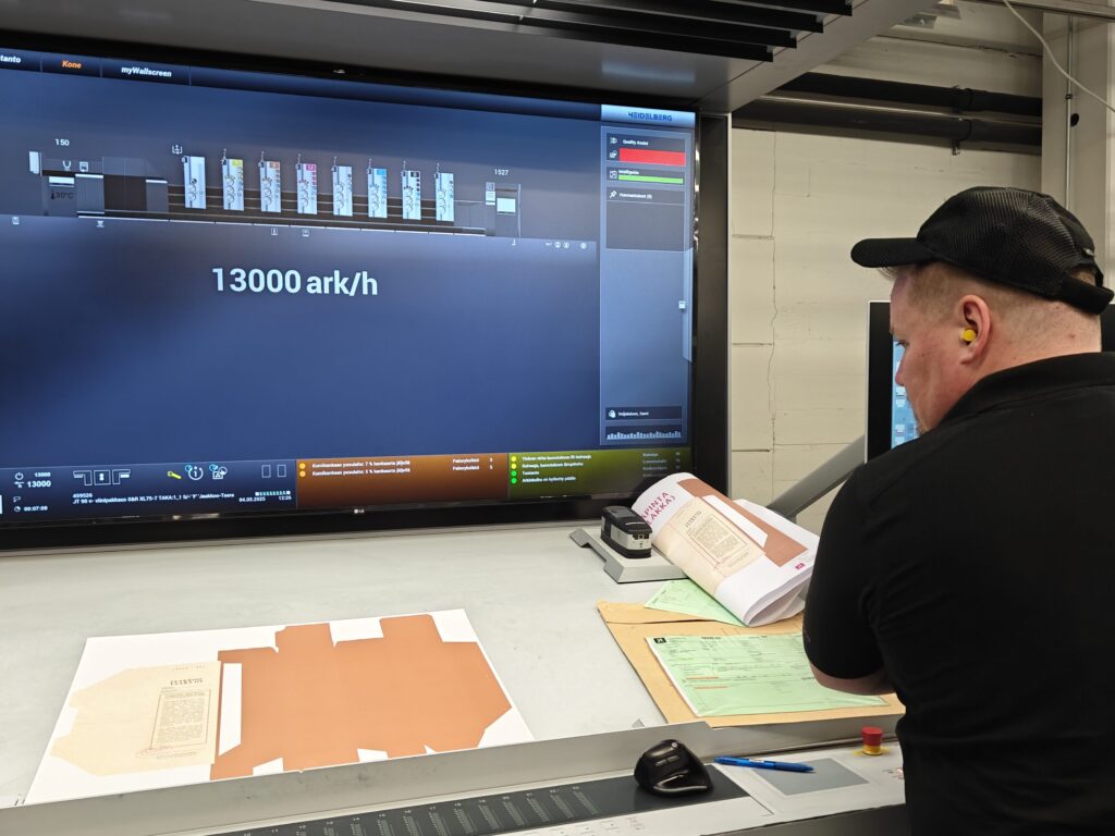
PREMerko participated in the design together with Jaakkoo-Taara and Packdesign ID and was responsible for the special printing.
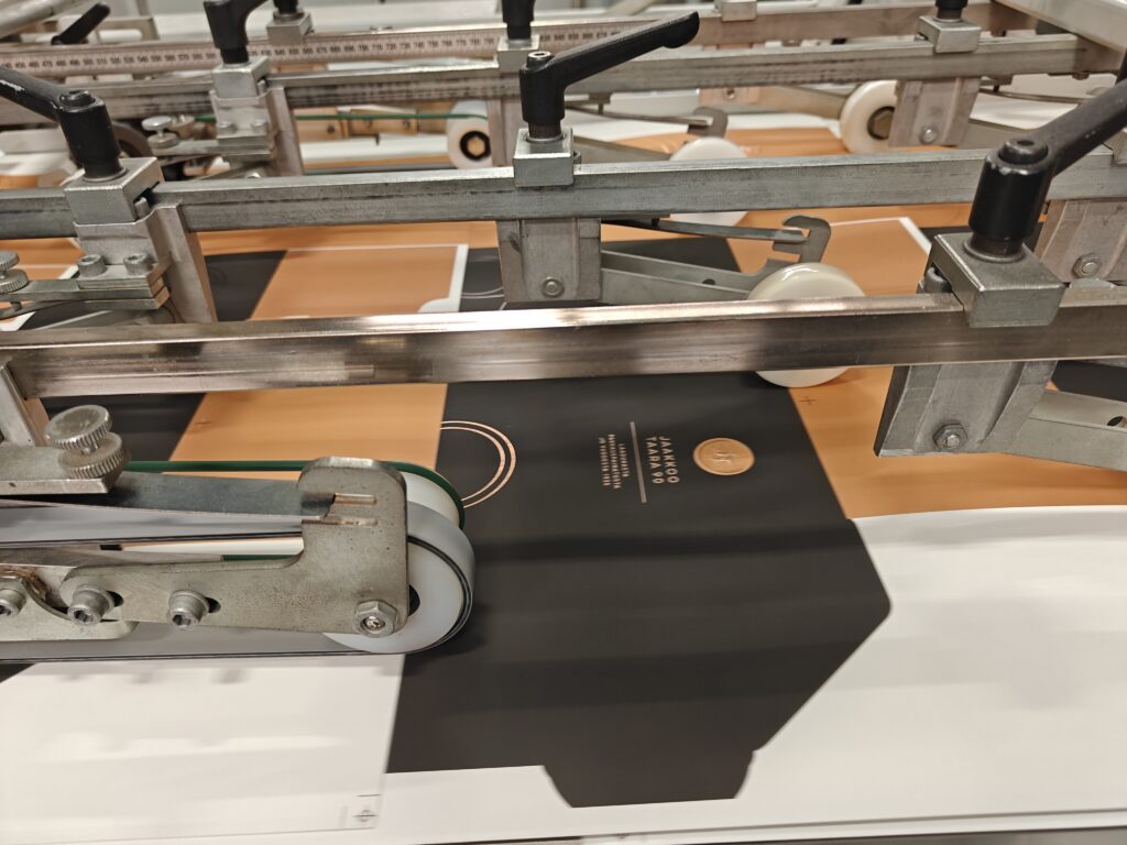
– Right from the start, we designed cost-efficient yet impressive print effects. Packdesign ID provided the plans, and we executed with our machines things like the rose gold on the package surface, metallized black, soft touch lamination, and 3D-structured embossings, says PREMerko’s Teemu Pärnänen.
On the outer surface of the case, a large number “90” is featured, with a design referencing printing techniques. The inside of the case was carefully considered.
– As a contrast to the modern exterior, we brought a touch of the company’s history inside the case: Jaakkoo-Taara began by printing waybills, so the inside of the case was styled to echo the appearance of old waybills while telling the company’s story, says Packdesign ID designer Ilona Sundell.

Seamless collaboration between companies
– Packdesign ID’s Ilona Sundell presented us with several designs to choose from. Each one sparked discussion and could have been selected, but in the end, we went with the most prestigious overall concept. We are very pleased with Ilona’s work, says Leppänen.
Special attention was paid to the anniversary package’s label and case, with details considered already in the design phase.
– When a wide range of effects are used, with multiple printing layers and a critical sequence of applying effects for the final outcome to succeed, compiling a clear and understandable print-ready material requires special attention from the designer, Sundell notes.
PREMerko handled the technical aspects of the effects. According to Pärnänen, the project was smooth to execute thanks to the skilled professionals involved in both design and production.
– From our perspective, the product was well designed and industrially feasible, which made execution streamlined. The package had to be designed so that the folds and openings still worked well once completed. The result turned out very striking and elegant. It would be fantastic if more daring use of special effects were seen in products for sale, as effects raise the value of packaging and allow the product to be sold in a higher price category, Pärnänen says.
The choice of partners did not take long, as Jaakkoo-Taara wanted to rely on companies already proven to be trustworthy.
– It was clear from the start that the partners would be PREMerko and Auraprint Oy. We have worked with PREMerko’s Teemu for a long time and knew we could trust him with finishing details. Teemu devoted himself fully to this project. He deserves major thanks for his success, Leppänen and Mäkilä emphasize.
Collaboration between the companies went smoothly. PREMerko has even learned from Jaakkoo-Taara’s way of working.
– We have tried to develop our operations to resemble those at Jaakkoo-Taara’s Turku plant. They have an efficient sales, order, and delivery process, high-quality standards, as well as clear and safe production facilities. We’ve learned a great deal from Jaakkoo-Taara, says Pärnänen.

The bottle label, in turn, was handled by Auraprint.
– Auraprint carried out the entire label, with Katriina Hieta as the prime mover. Her expertise was very welcome when considering what would work and succeed from a production perspective, says Mäkilä.
Olkkonen-Seppo also praises the inspiring project, where the company was able to realize its visions more broadly than usual.
– For us, this project has been truly enjoyable, as it involved skilled partners and the opportunity to use beautiful special effects and decorations, something rarely possible in purely commercial work. We feel the outcome is very successful, and we can proudly present this work to other clients as well! Olkkonen-Seppo says.
Leppänen agrees.
– The wine bottle and its packaging have received a great deal of admiration, attention, and praise.

